The kitchen has long ceased to be merely a functional space; it is the emotional and architectural centerpiece of the modern home. For decades, the monochromatic palette reigned supreme, offering a clean, simple uniformity. However, as design sensibilities evolve toward greater personalization and depth, the single-color kitchen is yielding ground to a far more sophisticated approach: the two-tone kitchen. This strategy utilizes the power of complementary and contrasting colors to define architectural features, control visual flow, and inject personality that monochrome schemes simply cannot replicate.
At KSI Cuisine Solutions, we recognize that mixing cabinet colors is one of the most powerful design tools available to homeowners and designers in the Montreal region. It is a calculated move that goes beyond simple aesthetics; it transforms volume, enhances lighting, and creates defined zones within open-concept layouts. The effective use of two distinct cabinet colors is the secret weapon for achieving a truly custom look that feels luxurious and perfectly tailored. Whether through subtle shifts in hue or dramatic oppositional palettes, the dual-tone approach provides visual anchor points and allows for the seamless integration of functional areas.
The core principle behind this revolution is strategic deployment. It is not about simply picking two colors you like; it involves mastering placement, texture, and light reflection. For instance, pairing rich, grounding colors on the lower cabinets with airy, reflective tones on the uppers can radically alter the perceived height of the room. This strategic deployment is often referred to as contrast cabinetry, a term encompassing the careful selection of finishes that play off one another to maximize visual impact.
As we look toward 2026, the two-tone kitchen is maturing from a niche trend into a fundamental design staple. Homeowners are moving past basic white and gray and experimenting with deep, saturated colors—forest greens, navy blues, and charcoal grays—paired expertly with natural wood finishes or bright neutrals. This evolution demands expertise in color theory and material science, ensuring the resulting kitchen feels harmonious, not disjointed. We see increased demand for sophisticated pairings, such as the timeless combination used in tuxedo kitchen cabinets, which always imparts a sense of formal elegance and drama. By exploring the principles, techniques, and future trends of mixed cabinet colors, homeowners can ensure their investment results in a kitchen that is both stunning today and resiliently stylish well into the next decade.
The Psychology and Principles of Two-Tone Kitchen Design
To master the art of mixing colors, one must first understand the visual psychology at play. A single color palette often results in a flattened, static environment. The introduction of a second, well-chosen color instantly creates dynamism, guiding the eye and establishing a hierarchy of visual importance. This technique is especially vital in large, open-concept spaces where defined boundaries are often absent.
Harnessing Visual Weight and Depth
Visual weight refers to how heavy or light an object appears. In two-tone design, dark, saturated, or highly textured colors carry greater visual weight, while light, muted, or reflective colors appear lighter. Applying this principle is the key to manipulating spatial perception. Typically, dark colors are reserved for base cabinets, islands, or perimeter runs that anchor the space, capitalizing on the psychological comfort of a grounded foundation. Lighter colors are then applied to the upper cabinets or shelving. This creates a visually lighter ceiling line, drawing the eye upward and making the room feel taller and more expansive—a classic design trick that leverages contrast cabinetry to expand small footprints. If the upper cabinets were dark, they might feel oppressively heavy, creating a compressed, enclosed feeling.
Establishing the 70/30 or 60/40 Ratio
Effective two-tone design rarely splits the colors 50/50. Successful execution relies on defining a primary dominant color (the 70% or 60%) and a secondary complementary color (the 30% or 40%). The dominant color usually covers the majority of the perimeter cabinets, while the secondary color is reserved for strategic focal points, such as the island, a specific wall of tall cabinets, or the interior of glass-fronted units. This intentional imbalance ensures that the overall design reads as coherent, with the secondary color acting as a sophisticated counterpoint rather than a competing element. This balancing act requires a keen eye for proportion, ensuring that the visual punctuation provided by the secondary color—often utilized as an accent island color—is impactful but not overwhelming.
The Role of Finish and Sheen
Color is only one component; the finish dramatically influences how the two colors interact. A high-gloss lacquer finish on a cabinet door reflects light intensely, making the color appear slightly lighter and brighter, while a matte finish absorbs light, giving the color a richer, deeper saturation. Combining different sheens can provide a subtle two-tone effect even if the colors are relatively close in hue (e.g., matte dark gray base cabinets paired with a satin finish dark gray tall pantry). Conversely, if you choose two drastically different colors, maintaining a consistent sheen (such as a smooth matte finish across all surfaces) helps unify the design, making the color shift feel intentional and sophisticated rather than disjointed. This meticulous attention to texture is crucial for achieving high-end results, moving beyond simple painting into truly tailored joinery.
Classic Contrast Archetypes: The High-Impact Palette
While the possibilities for mixing colors are endless, certain pairings have proven timeless, capable of delivering maximum elegance and impact regardless of shifting kitchen color trends. These archetypes rely on strong, recognizable contrasts that are inherently balanced.
The Everlasting Elegance of Tuxedo Kitchen Cabinets
The tuxedo style, inspired by formal evening wear, remains the gold standard for high-contrast, modern luxury. This archetype typically pairs stark black or deep charcoal gray with crisp, bright white. The traditional deployment involves white upper cabinets to maintain an open, airy feel, contrasted sharply by dark lower cabinets or dark full-height pantry towers that ground the room.
The appeal of tuxedo kitchen cabinets lies in their ability to evoke both classic sophistication and sharp modernity. They demand precision in design, as the intense contrast highlights every line and joint. In contemporary applications, designers may reverse the pattern, using white for the main perimeter and black for the island and surrounding integrated appliances, creating a powerful central focal point. This specific high-contrast approach offers unparalleled adaptability to handle different hardware styles; sleek, brushed brass pulls elevate the look to Art Deco glam, while simple matte black handles emphasize minimalist modernity.
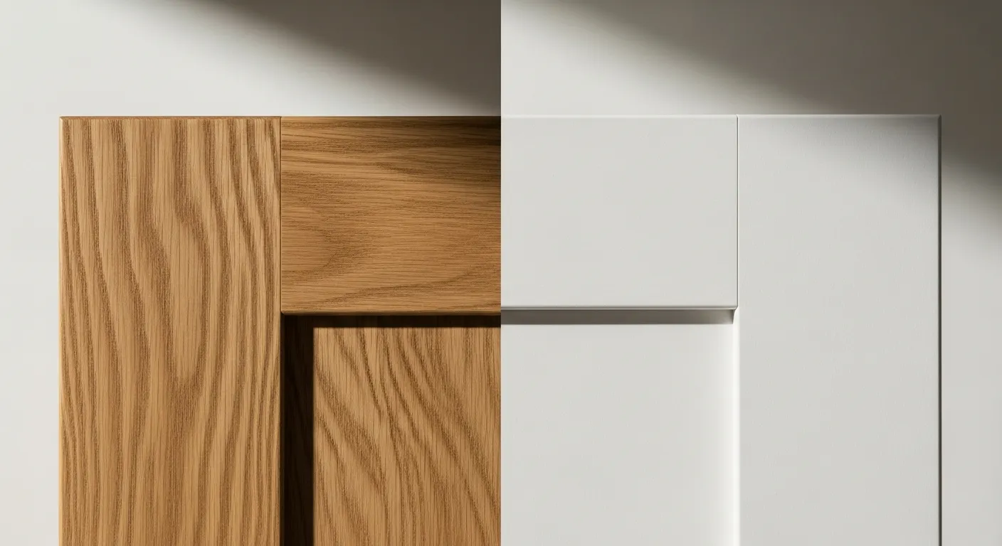
White and Wood: The Natural Contrast
Perhaps the most enduring two-tone combination is the pairing of pure white cabinets with natural wood grain, often utilized in modern Scandinavian and transitional designs. This combination works because it balances the sterile purity of white with the organic warmth and texture of the wood. The white acts as the canvas, reflecting light and amplifying the spaciousness, while the wood introduces necessary texture, color depth, and tactile appeal.
Common applications include:
1. Wood Base, White Uppers: Provides a visually heavy, grounded feel with a light top half.
2. White Perimeter, Wood Island: The island becomes a warm, furniture-like piece, often paired with matching floating wood shelves.
3. Wood Accents: Incorporating wood only as open shelving, hood surrounds, or toe kicks to provide warmth without overwhelming the room.
In 2026, the trend shifts away from high-sheen cherry or overly yellow oak towards richly textured walnut, rift-cut white oak, or sophisticated smoked finishes. These natural wood tones, when expertly employed in contrast cabinetry, provide an unmistakable element of luxury and craftsmanship that elevates the entire kitchen design.
Jewel Tones Meet Neutrality
For the homeowner seeking high drama without resorting to black and white, pairing deep, saturated jewel tones with a pale neutral provides a stunning effect. Imagine rich sapphire blue or emerald green cabinetry contrasted with a warm, creamy off-white or a pale greige.
These pairings inject significant personality and color without becoming overwhelming, provided the jewel tone is reserved for the lower cabinets or, crucially, utilized as the designated accent island color. The saturated color absorbs light, making the cabinets appear denser and more substantial, while the neutral color ensures the overall space remains bright and inviting. This technique is often used in Montreal designs to add depth and warmth, offsetting the cool light often found in northern climates.
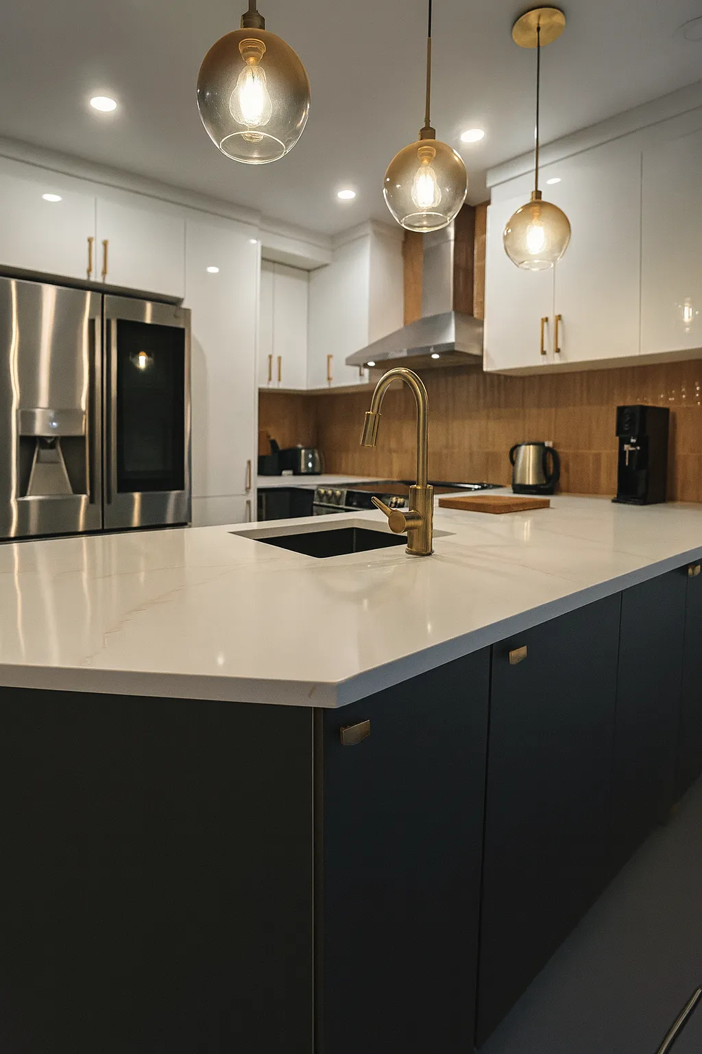
The Strategic Role of the Kitchen Island: Creating the Focal Point
In the realm of two-tone design, the kitchen island serves as the primary stage for color experimentation. It is a distinct, free-standing unit whose architectural separation makes it an ideal candidate for a color that differs drastically from the perimeter cabinetry. Focusing the secondary color on this element is often the safest and most effective method for dipping into bolder design choices.
Defining the Accent Island Color Strategy
Using an accent island color offers several key benefits. First, it immediately establishes the island as the focal point of the room, drawing the eye to the central workspace and social hub. Second, it breaks up the monotony of long cabinet runs in expansive kitchens. If all the perimeter cabinets are white, a deep gray or a vibrant blue island prevents the space from feeling too sterile or repetitive.
When selecting the accent color, it doesn’t necessarily need to be a completely different hue; often, choosing a different shade of the main color (e.g., pale gray perimeter and charcoal island) provides enough separation to define the space without introducing visual chaos. However, the boldest and most rewarding results often come from introducing a completely new color—perhaps a bold terra cotta or a soft sage green—that complements the colors visible in adjacent living areas, thus integrating the kitchen seamlessly into the home’s broader design narrative.
Integrating Textural Contrast
The island is also the perfect place to introduce textural contrast, leveraging the concept of contrast cabinetry not just through color, but through material. If the perimeter cabinets are painted MDF or wood, consider cladding the island in a different material altogether, such as fluted wood panels, shiplap, or even specialized textured laminates.
For example, a kitchen featuring minimalist, flat-panel white cabinets on the perimeter might benefit immensely from an island clad in deep, wire-brushed black oak. The difference in texture amplifies the color separation, making the island feel like a piece of bespoke furniture designed to be admired, not just used. Furthermore, incorporating contrasting materials in the island base can also justify a countertop material that differs from the perimeter counters (e.g., durable laminate on the perimeter, luxurious quartz or natural stone on the island).
Balancing the Island’s Mass
Because islands can be quite massive, the careful selection of the accent island color is crucial for managing visual weight.
* For Large Islands: Choose a slightly darker shade. If the island is huge, making it a light color might cause it to feel visually dominant and overwhelming. A deep, rich tone helps it recede slightly while still functioning as a powerful anchor.
* For Smaller Islands: Lighter accents or high-gloss finishes can help a smaller island feel more present and reflective, preventing it from getting lost amidst large perimeter cabinetry.
* Color Continuity: Remember that the island color must harmonize with the backsplash, flooring, and wall paint. It should be the strongest color in the room, but it should never clash with the permanent architectural finishes.
Advanced Color Blocking Kitchen Techniques
Moving beyond the simple upper-vs-lower split requires thoughtful zoning, a design strategy known professionally as color blocking. Color blocking kitchen design applies the principles of graphic design to cabinetry, using color to segment functional areas and create striking visual compositions.
Vertical Segmentation and Zones
The standard two-tone approach separates the kitchen horizontally (top light, bottom dark). Advanced color blocking introduces vertical separation. This is particularly effective in kitchens that feature a wall of floor-to-ceiling cabinetry, often housing the pantry and integrated appliances.
* Appliance Wall as the Block: Designating the entire appliance and pantry wall (the “service zone”) in one color—such as a deep forest green—while keeping the main cooking and sink perimeter (the “prep zone”) in a lighter color, immediately differentiates the zones. This technique adds sophistication and avoids the visual break-up that occurs when trying to mix colors on a tall wall of cabinets.
* Symmetry and Framing: Use a strong secondary color to frame a key architectural feature, such as surrounding the range hood or wrapping around a breakfast nook. This creates a powerful, intentional ‘block’ of color that highlights the feature within the overall kitchen architecture.
Layering the Two-Tone Approach
For truly bespoke designs, color blocking kitchen strategies can involve layering the two colors. This means using the primary color for the majority of the room, and then using the secondary color in three strategic, high-impact areas:
1. The Base Cabinets: The grounding element.
2. The Island: The focal point (leveraging the accent island color strategy).
3. Open Shelving/Interiors: The interior of glass-front cabinets or the back wall behind floating shelves, providing a subtle, unexpected color echo.
This layered approach ensures that the secondary color is present at three different heights and depths within the room, making the overall design feel deeply considered and cohesive, rather than a simple split decision.
Comparison of Two-Tone Application Methods
| Strategy | Application Area | Visual Impact | Design Goal | Common Pairing Example |
| Horizontal Split | Dark Lowers / Light Uppers | Height and Lightness | Expansion and Grounding | White Uppers, Navy Lowers |
| Focal Point Contrast | Perimeter Primary / Island Secondary | Centering and Drama | Creating a Focal Hub | Grey Perimeter, Wood Accent Island |
| Vertical Blocking | Tall Cabinets Secondary / Perimeter Primary | Zoning and Order | Defining Functional Areas | Deep Blue Pantry Wall, Cream Perimeter |
| The Tuxedo Effect | Black Base / White Uppers/Counters | Formal and Sharp | High-Contrast Luxury | Tuxedo kitchen cabinets (Black/White) |
Achieving successful contrast cabinetry through color blocking requires careful attention to the transition points. Where the two colors meet (e.g., at the corner of an L-shaped kitchen), the design must be clean and intentional, often separated by a continuous line of hardware, a countertop, or a change in cabinet style (e.g., flat panel meeting shaker).
Integrating Materials and Textures for Deeper Contrast
A truly advanced two-tone kitchen goes beyond just paint color; it integrates texture, material variation, and finish choices to deepen the contrast and add tactile richness. This material interplay is vital for luxury design, where visual simplicity often belies material complexity.
The Power of Mixed Finishes
As discussed, sheen affects color, but mixing materials entirely transforms the feel of the cabinetry. Modern kitchens often utilize matte laminates or smooth painted finishes. Integrating a different material—such as glass, metal mesh, or natural veneer—into the overall scheme serves as a third, highly textural layer that complements the two primary colors.
For example, a kitchen might feature matte black base cabinets and pale taupe upper cabinets. To elevate this, designers at KSI Cuisine Solutions often integrate aluminum-framed glass cabinets or open shelves backed by ribbed brass sheeting. This provides a reflective, structural element that interacts with both the black and the taupe, adding a crucial layer of visual sophistication that plain painted cabinets cannot achieve. This complex layering moves the concept beyond simple painting into truly dimensional contrast cabinetry.
Embracing Tactile Materials (Wood and Metal)
In 2026, the resurgence of natural, tactile materials remains strong. Pairing wood with metal is a sophisticated take on the two-tone concept. Instead of painting a cabinet one color, consider using metal finishes for hardware, toe kicks, integrated handles, or even thin framed cabinet doors.
When designing sophisticated two-tone kitchens, the integration of wood often serves as the neutral intermediary. For example, if the perimeter is a crisp white, and the island utilizes a strong accent island color like deep burgundy, introducing a mid-tone walnut veneer on the tall utility cabinets softens the transition between the two aggressive colors, providing an organic visual break. The wood acts as a harmonious third color that bridges the gap between the extremes, ensuring the final result feels bespoke and grounded.
Countertop Coordination in Dual-Tone Schemes
When mixing cabinet colors, it is often best to keep the countertop choice consistent or closely related, especially on the perimeter. Using three different cabinet colors *and* three different countertop colors can quickly overwhelm the space.
A popular strategy is to choose one dominant, neutral countertop material (e.g., a white quartz with subtle veining) for all perimeter cabinets, and then introduce a dramatically different material on the accent island. This second material could be something highly textural, like honed soapstone, dramatically veined marble, or butcher block, reinforcing the island’s role as the central color block and creating true material color blocking kitchen composition. This focused use of luxurious materials ensures the design remains cohesive while maximizing the impact of the primary focal point.
Future-Proofing Your Design: 2026 Kitchen Color Trends and Palettes
To ensure a two-tone kitchen built today remains stylish well into 2026 and beyond, designers must look past fleeting fads and choose palettes that possess inherent longevity and adaptability. The current trend focuses on comfort, nature-inspired depth, and quiet luxury.
The Rise of Earthy and Saturated Tones
While white remains a reliable primary color, the most striking kitchen color trends involve grounding the design with deep, natural hues that evoke the landscape.
* Deep Greens (Forest and Moss): These sophisticated greens feel organic and restful. They pair exceptionally well with warm wood tones (like oak) and soft brass hardware. A two-tone kitchen might use deep moss green for the lower base cabinets, paired with a soft, warm beige or light mushroom gray for the uppers, achieving a subtle yet impactful contrast.
* Muted Blues and Teals: Moving away from the saturated navy of previous years, 2026 sees the emergence of dustier, more muted blues and teals. These colors are softer and easier to live with, acting as perfect counterparts to creamy whites or light grays in tuxedo kitchen cabinets applications where a stark black might feel too severe.
* Warm Neutrals (Greige and Taupe): These colors provide essential warmth, moving away from the cool, stark grays that dominated the last decade. Taupe or greige perimeter cabinetry provides the perfect sophisticated canvas when the bold secondary color is reserved for the island, utilized as a dramatic accent island color.
Strategic Use of Bold Color in the Details
For clients hesitant to commit large surfaces to bold colors, future-proofing involves using intense color strategically in small, easily updated areas. The commitment to durable, neutral materials (like white oak, white marble, or black steel) on the perimeter is paramount, allowing the pop of color to be provided by the secondary element.
* Interior Pop: Paint the interior shelves of the pantry or glass-front cabinets in a vibrant citrus or deep crimson. This provides a stunning, controlled flash of color that adds depth without dominating the design.
* Floating Shelf Backing: Use the secondary color to paint the wall behind floating shelves, creating a modern, linear line of color blocking that is easily updated if future kitchen color trends demand a refresh.
Durability and Consistency in Contrast Cabinetry
The ultimate key to longevity in two-tone design is the quality of the materials and the consistency of the application. High-quality finishes ensure that the dark color doesn’t fade and the light color resists staining. Furthermore, ensuring that the two colors share a common undertone (e.g., both having cool gray undertones or both having warm yellow/brown undertones) prevents the palette from feeling randomly assembled. This meticulous planning ensures that the dramatic visual appeal of color blocking kitchen design translates into a lasting, high-value investment.
Crafting Your Bespoke Two-Tone Kitchen with KSI Cuisine Solutions
The shift toward two-tone cabinetry represents a profound move toward sophisticated, personalized kitchen design. By strategically deploying two colors—whether through high-impact choices like tuxedo kitchen cabinets or by focusing on a dramatic accent island color—homeowners can create spaces that are dynamic, functional, and visually balanced.
Mastering this art requires more than just mixing colors; it demands an understanding of light, visual weight, texture, and architectural zoning. Through advanced techniques like sophisticated color blocking kitchen layouts and careful attention to material harmony, the two-tone approach ensures that the kitchen remains relevant and elegant, perfectly positioned for the design landscape of 2026. This focus on intentional and long-lasting contrast cabinetry guarantees an enduring return on investment.
If you are ready to transform your Montreal home with a bespoke two-tone kitchen that reflects the latest kitchen color trends while offering timeless elegance, the experts at KSI Cuisine Solutions are here to guide you. Contact us today to begin designing a kitchen where color and craftsmanship converge.

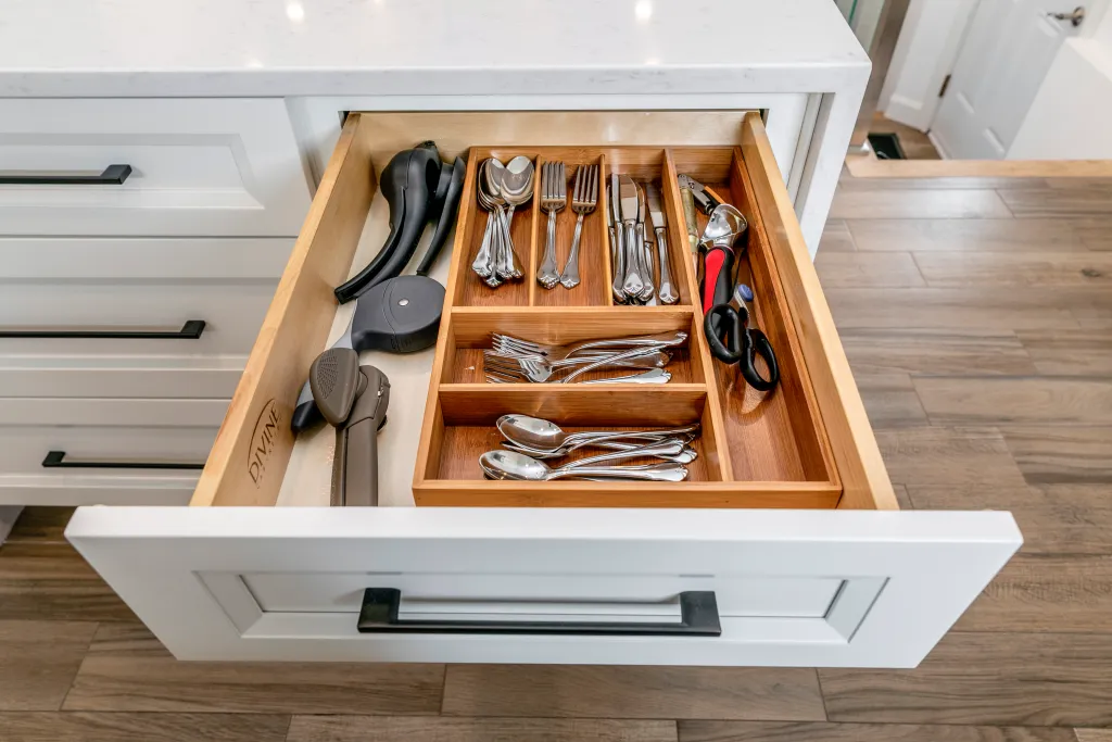
Maximize Kitchen Space: The Ultimate Guide to Intelligent kitchen cabinet organizers
The kitchen is often called the heart of the home, but without a systematic approach to organization, it quickly becomes […]

Two-Tone Kitchens: Mastering the Art of Mixing Cabinet Colors for Timeless Design in 2026
The kitchen has long ceased to be merely a functional space; it is the emotional and architectural centerpiece of the […]

The Ultimate Cabinet Showdown: Solid Wood vs. MDF for Your Kitchen Cabinets Montreal
Renovating a kitchen is one of the most significant investments a homeowner can make. While aesthetics often drive initial choices—the […]